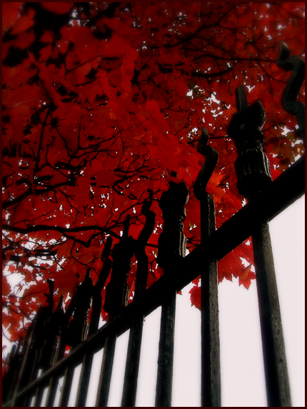
- Title: the prophet said...
- Artist: vueh
- Description: hey.
- Date: 05/06/2009
- Tags: tree redleaves fence leaves
- Report Post
Comments (7 Comments)
- MidnightxMonster - 03/07/2010
-
Beautiful. The contrast between the red and black is perfect. The white light shining in between the spaces of the gate adds a nice effect as well. I'm glad you did not let any other objects interfere with this photograph.The subject is straight to point and obvious. I love your angle of perspective too. 5/5
Rate my work as well? <3 - Report As Spam
- -Wicked-Lusts- - 05/31/2009
- Very effective....well done.
- Report As Spam
- cens-r - 05/12/2009
- i really love this personally. the angle is lovely and your theme is nice. i do have a suggestion. i know i probably sound really annoying: but maybe you could brighten the picture a little. i can see "shade" is kinda the point but a little brighter might lift the mood a little bit and enhance your picture even further! other than that i love it. you have some talent :]
- Report As Spam
- peppermint606 - 05/10/2009
- its really cool,mysterious, and beautiful !
- Report As Spam
- knopt notion - 05/10/2009
- i love it!!
- Report As Spam
- iEatRawFishOo - 05/10/2009
- This is really pretty. 5/5
- Report As Spam
- Instant Superstition - 05/07/2009
- 5/5 for you. The leaves of the tree have a beautiful color!
- Report As Spam


