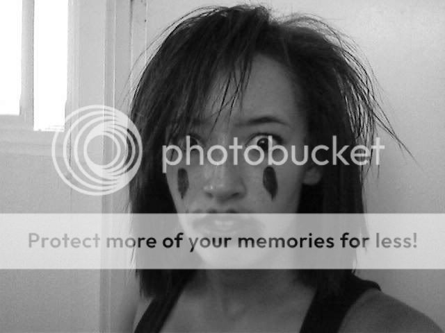
- Title: Face Shop
- Artist: aneetuh
-
Description:
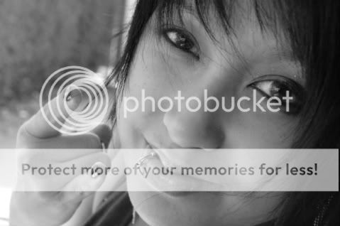
this is a photo... just so you know... haha... well i was inspired by make up ads with this photo.. i edited it to look almost like a painting... but i promise you its a photo... anyway... I loved the contrast and brightness of the colors from the plain white background... and all in all i loved how it turned out... hope you like it too..
(*n.n*) - Date: 10/15/2008
- Tags: face shop
- Report Post
Comments (4 Comments)
- XxMr_KoNfUsEdxX - 04/18/2009
- even without the rounding its AWSOME but still, i agree that if u round it out some, it would look even better 5/5
- Report As Spam
- Poisonous Sumac - 01/06/2009
- true smooth it out ish funkeh ;P
- Report As Spam
- aneetuh - 10/16/2008
-
thanks for the tip.. I'll try..
(*n.n*) - Report As Spam
- PimpZord - 10/16/2008
- too many photoshop filters. you have abused the image so much that it went pixelated. you should probably go in and smooth out the edges to make a more polished, professional look. when you do that it will be AWESOME.
- Report As Spam


