- by layenicorn |
- Painting And Drawing
- | Submitted on 05/31/2011 |
- Skip
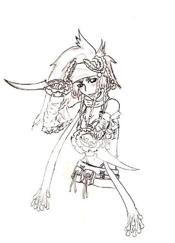
- Title: Riin Viern
- Artist: layenicorn
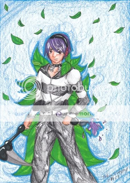
- Description: well, I really do think it looks unique without the shading :3
- Date: 05/31/2011
- Tags: riin viern
- Report Post
Comments (4 Comments)
- Raeshe - 11/03/2011
- I actually like this without the shading. It looks retro. ^-^ Kudos on drawing the wrinkles and crinkles, they look sharp. 5/5!
- Report As Spam
- THE BAD LADY - 10/12/2011
- with shades it would look really pretty :3 maybe you should edit the left foot. the toes are a little wrong, theyre getting smaller when they go back, you drew them bigger -^^-
- Report As Spam
- layenicorn - 05/31/2011
- @unlucky hexes: well, thanks for your opinion, it pretty much helped biggrin . I did shaded this already before, I just took out the shading for this though. Sorry...btw, the art is semi-realism. But your opinion is really appreciated smile
- Report As Spam
- brievee - 05/31/2011
- I wouldn't call it " unique, " really. To me, it's either - the artist trying to make it look like a cartoon when it clearly isn't, or - the artist was just too lazy / busy / etc. to shade it at all. That's how it comes out to me. : | That's just my opinion.
- Report As Spam


