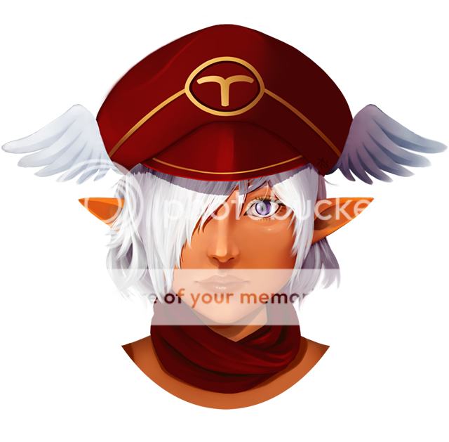
- by InnocenceIsMine |
- Painting And Drawing
- | Submitted on 08/02/2010 |
- Skip
- Title: ._.
- Artist: InnocenceIsMine
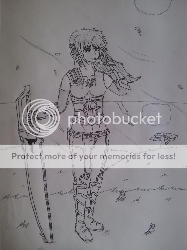
- Description: Another drawing :D Srry for the bad proportions, and messy lines ^-^;. Please tell me nicely on what to improve on TY.
- Date: 08/02/2010
- Tags:
- Report Post
Comments (4 Comments)
- InnocenceIsMine - 08/05/2010
- oh ok thanks you guys ^^
- Report As Spam
- Revolver Oshawott - 08/05/2010
- The thing covering her mouth is too small. It gives us the impression that the rest of her face is cut so it would fit, and that she has a very small neck. Make it a little bit longer and wider, as well as adding a few lines to the "neck part" to make is look like it's a little more loose.
- Report As Spam
- YUKlE - 08/05/2010
-
At Lady Sume-
Her face is half covered up, that dot you assume is the mouth is actually the nose.
Good work ;D - Report As Spam
- Rosilien - 08/02/2010
- Her eyes are very low on her face. I like the style, and i think this picture would benefit from moving the eyes up towards the top of the head, making her forehead seem less tall. Other than that, i love the blush and sweater!
- Report As Spam


