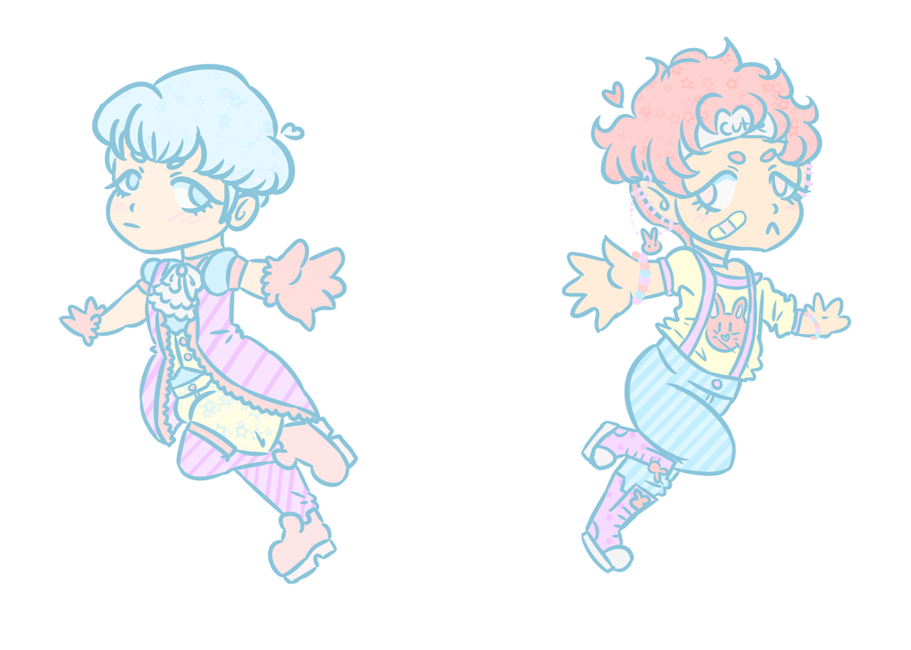
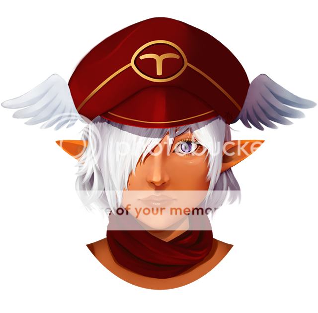
- Title: Jillian Tinierme
- Artist: Wolfunite
-
Description:
man this was fun!! I just had to try this different way of coloring!!
Hows it look? Better or worse? Hair and skin is much better to color this way and it looks a little more natural with the folds so I might start coloring this way :3
Hope you guys like and comments and critiques are welcome!!!
visit me on deviantart: wolfunite.deviantart.com - Date: 06/09/2010
- Tags: jillian tinierme avatar wolfunite manga
- Report Post
Comments (6 Comments)
- cokefair - 06/14/2011
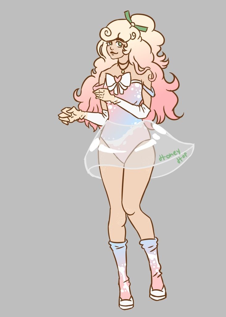
- I love it all , but from the torso down it looks a bit peculiar . But in all wonderful drawing ! The face is to die for ♥ 5/5
- Report As Spam
- xi twin_less ix - 06/12/2010
-
It seems to have a story to it. I like it, a lot. Though your other knee(the top one) seems to be a bit too short. But other then that...great.
The face as the cutest.
And that hair was wonderful...I loved the curls.
It's the second drawing I rated 5/5... - Report As Spam
- Wolfunite - 06/09/2010
- for this one I did a pencil drawing, uploaded it and then overlayed the colors in easy paintool sai
- Report As Spam
- klutzy_penguin - 06/09/2010
- how did you color? i have a hard time figuring out a good way to color in my drawings
- Report As Spam
- Sir Dark Hat - 06/09/2010
- For some reason it looks like her legs are out of proportion with her upper body... looks really cute though!
- Report As Spam


