- by xXDead-Before-It-BeganXx |
- Painting And Drawing
- | Submitted on 12/13/2009 |
- Skip
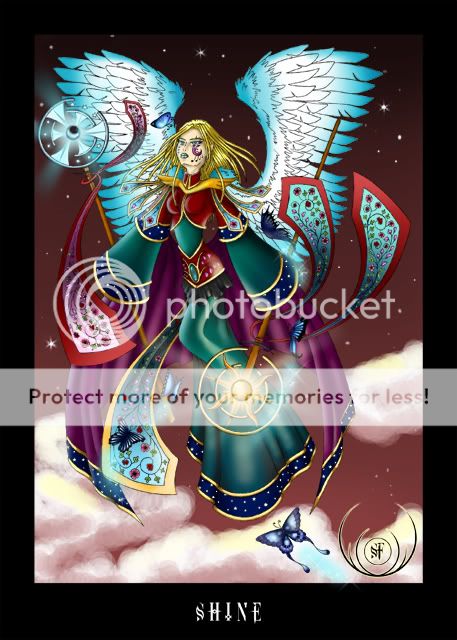
- Title: two sides of a person
- Artist: xXDead-Before-It-BeganXx
-
Description:
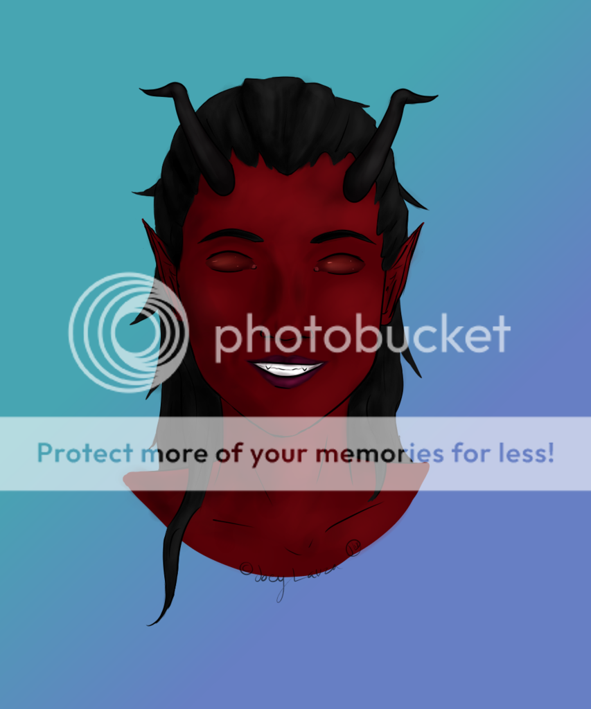
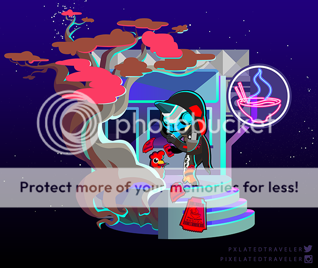
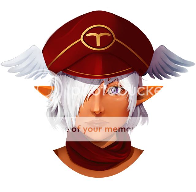
first painting i have done of people
- Date: 12/13/2009
- Tags: sides person
- Report Post
Comments (4 Comments)
- Phantom-of_Winter - 12/15/2009
-
-continued-
look too rounded. The other wing (the decayed bat wing) looks wicked cool. But you might want to add some more light contrast within it so that it can really pop out more. Also, the hair should deserve the care as the body (add some dark vales to it and I don't mean the outlines).
Your anatomy is looking much better, but as I said before, you keep repeating some mistakes. You are getting along nicely, keep up the good work! 3/5 - Report As Spam
- Phantom-of_Winter - 12/15/2009
-
I am very impressed; you are much better with using paint than pencil. I also like how you colored the feathered wing.
Is this a light and dark theme?
Now the critique; again, you keep repeating you mistakes I'm afraid. The chest is too high and the arms are way too thin. Also the mouth is either too big for the face or too close to the chin. Now... you do well with the wings, but the feathered wings looks too rounded (which it shouldn't be). Make it smaller or smooth it out so that it doesn't - Report As Spam
- xXDead-Before-It-BeganXx - 12/13/2009
- =]
- Report As Spam
- ghostly411 - 12/13/2009
- side view is pretty cool
- Report As Spam


