- by Rin Nagoyaka |
- Painting And Drawing
- | Submitted on 03/02/2009 |
- Skip
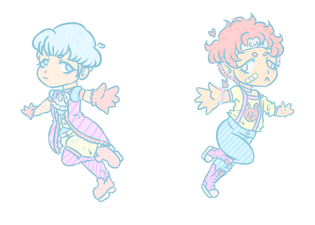
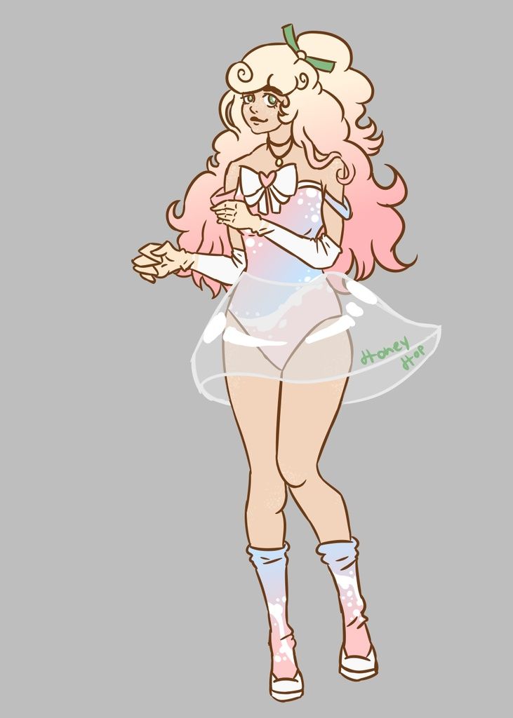
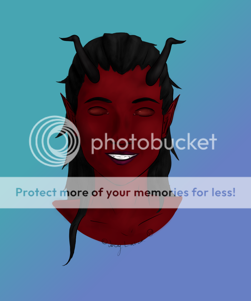
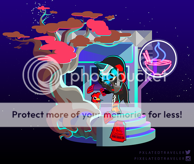
- Title: This shot was a lil better...
- Artist: Rin Nagoyaka
-
Description:
2nd shot at GIMP. dont really like it tho...have to get tablet thingy...oh noez...
AnywayZZZ, please, as my last one, dont discourage me wit teh bad commentoz, plzzz - Date: 03/02/2009
- Tags: shot better
- Report Post
Comments (4 Comments)
- Mitsuko-dono - 06/09/2010
- not much to ay other than cute ^^
- Report As Spam
- SixMinutesToLive - 07/27/2009
- I like this picture, It's really cute. Like GuardianAllieKat mentioned I suggest you try using layering but all in all it's a nice piece of work. Keep it up. :]
- Report As Spam
- Jellybean Julie - 03/05/2009
-
how lovely ur pic is
nice photobucketing - Report As Spam
- XizzyCupcake - 03/02/2009
- did u do this in phototshop if u did i would suggest useing layers instead of the paint bucket becaus if u look closely on the hair u can see where there is pixels left form the paint bucket. and if u use layers u can make it so u dont go over the black lines. im not saying this to be bad coz this is a wonderful pic <3 im just giving u suggestions on how u can make this better ^_^ if u need help pm me (again not trying to be discouraging its really cute love the cheeks)
- Report As Spam


