- by Sam the Morningstar |
- Painting And Drawing
- | Submitted on 02/14/2009 |
- Skip
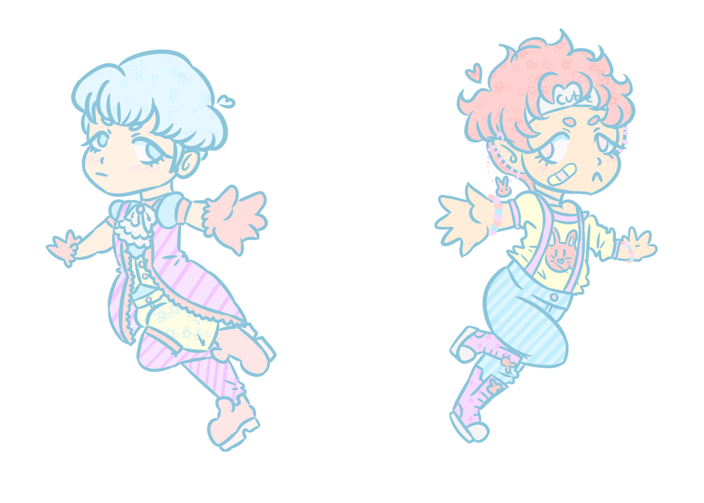
- Title: Pocket Change B+W Concept
- Artist: Sam the Morningstar
- Description: Concept for the cover of my comic Pocket Change! I can't work on the actual comic yet, due to lack of an editor for the script! I will give you 100 G to critique it! PM me for information
- Date: 02/14/2009
- Tags: pocket change cover pocketchange comic
- Report Post
Comments (7 Comments)
- x_tinyheart_x - 07/04/2009
- the faces seem like it could be someone's face in real life but at the same time it looks like it is a little not real...
- Report As Spam
- riedelms - 06/11/2009
- nice shading..i like the way you shade some dark spots..
- Report As Spam
- -alexbunnii- - 02/15/2009
-
Bara bara? o.O
- Report As Spam
- booboolooboo - 02/15/2009
-
just like what Kool Chik Kyra said, the lips are too big and the nose is a pit "sharp". I also love the details 3/5
- Report As Spam
- xx--Moonlit Misery - 02/15/2009
- yeah...they do both look like men...and the noses are a bit pointy...but nice job otherwise...x3
- Report As Spam
- Sixverstein - 02/14/2009
- Great detail on the hair. :3
- Report As Spam
- CatBugBus - 02/14/2009
-
if its supost to be a man and woman i cannot make out the differance,the man/woman on bottem has to big of lips she/he looks very hispanic and black( not tryin to be racist,they just have big lips! /: )
and for the one on top its kind of difficult to see the iris/pupil
you can still see that hes looking down but still,great work love the details 3/5 =D - Report As Spam


