Comments (7 Comments)
- Rin Nagoyaka - 07/19/2009
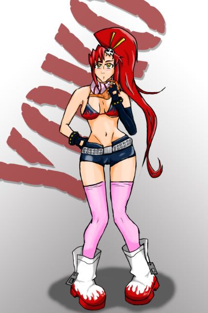
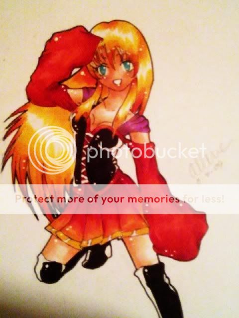
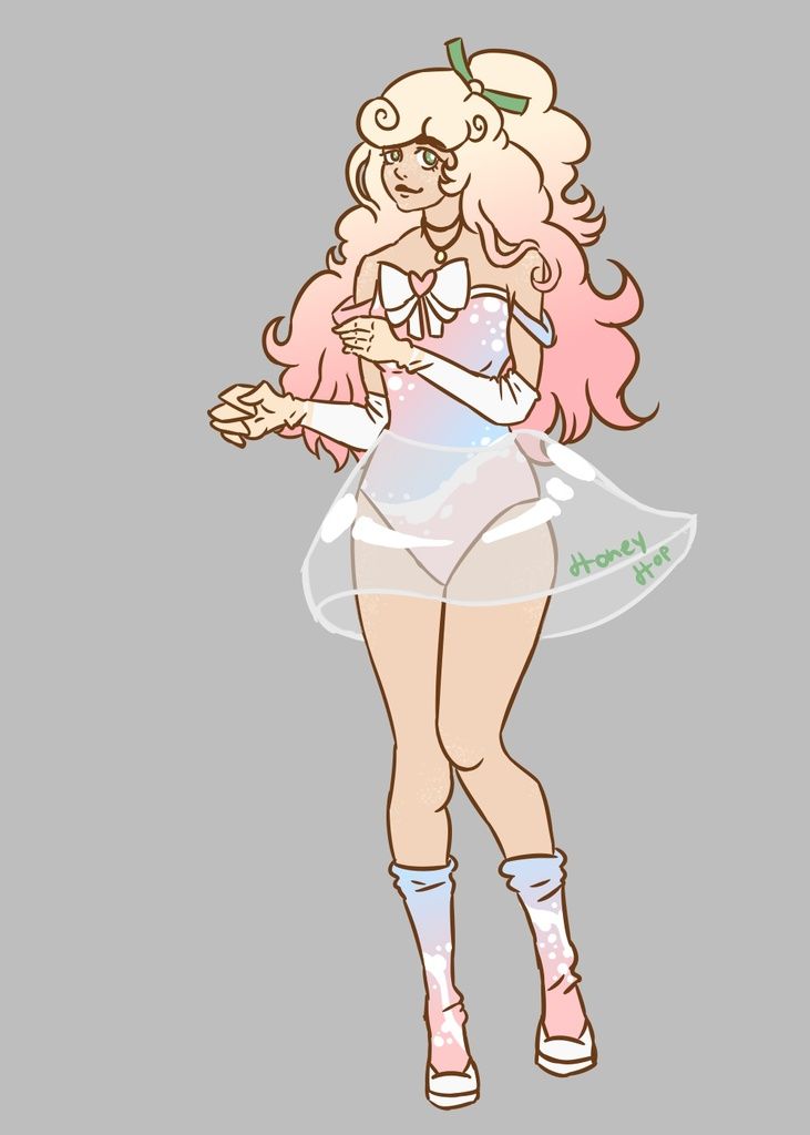
- the way you structured her face..its bothering me...the chin is a bit to wide..looks manly...
- Report As Spam
- CuteChibiYoko - 04/16/2009
- the breast is a little bit freaky but good
- Report As Spam
- Miss-Muffin-chan - 04/13/2009
-
Her hips are a bit too wide,
I love her facial expression.
And her shoes are just amazing! ^-^ - Report As Spam
- kabatt - 04/13/2009
-
if it's first work on tablet it's really good (i've got heebie-jeebies when i think about my first >.< wink but here are some proportion mistakes: her a** is big but she has no belly-under the costa is the hip. and her head is disproportionate small to her body.
if it's Your first drawing with tablet, i imagine You must be good so gonna watch Your next arts smile - Report As Spam
- Santigold - 04/13/2009
- Cute. The anatomy is a little off though.
- Report As Spam
- SkaterX57 - 04/13/2009
- AHHHHHHHHHHHHHHHHHHHHHHHHHHH
- Report As Spam


