- by Sakura-Sachiko Takahashi |
- Comics
- | Submitted on 10/19/2009 |
- Skip
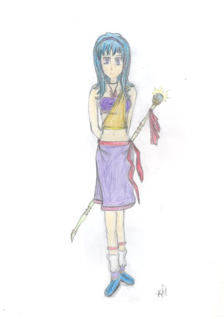
- Title: My 2nd own anime character
- Artist: Sakura-Sachiko Takahashi
-
Description:
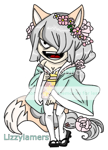
My 2nd own anime character
I apologize if the scan is not that good but i still haven't learnt how to use it perfectly, only the basics.
Please tell me your opinion & rate me.
- Date: 10/19/2009
- Tags: anime character
- Report Post
Comments (7 Comments)
- Roxy Hazard - 04/06/2010
- its a cute design, i especially like the hair. but i would recommend borrowing sum anatomy or art books from a library to figure out how to draw a little more in proportion. 4/5 & good luck in the art world!
- Report As Spam
- tygirltaco - 12/04/2009
-
Very good, I believe, though I agree with the critiques offered by Yume_Silvermoon, I'd also add you may want to fix the head, I know someone who does the same thing and makes it look kinda squished-ish. But very good other than that!
4/5 for good design/concept, as well as literacy in your description. ^'^ - Report As Spam
- yui53 - 12/03/2009
- good job (especialy on the legs; i can't draw legs DX) the eyes kinda kreep me out though
- Report As Spam
- mmaireadd - 11/25/2009
- A bit out of proportion, and a bit too skinny. The eyes aren't that hot either.
- Report As Spam
- Kiiysh - 10/19/2009
- no offence, but the eyes arent too good.... sad
- Report As Spam
- 0Shawn0 - 10/19/2009
- the knees? yeah little too low :l
- Report As Spam
- Yume_Silvermoon - 10/19/2009
- Cute design. I think she looks a little bit off balance, and her legs and hips seem to thin for her upper body. Even if she's young, her legs should be a little thicker than her arms. Also, her knees look too low. I really like the wand. The ribbon is a nice touch. The bold colors make her look like a bright, fun person, while purple gives her a mysterious air... good for a magical character (which I'm guessing she is because of the wand?) I'm curious to know more about her!
- Report As Spam


